adjustment of the amount of space between certain combinations of letters in proportional-pitch type. If the combination "To" is typeset with the same letter spacing as "Th," the letters seem to be too widely spaced. "To" looks better if the top of the "T" is allowed to overhang the "o" slightly. See Figure 148.Compare tracking.
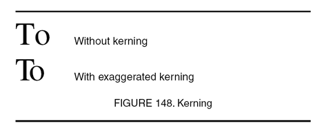
typesetting technique that overlaps the edges of two type characters to provide the illusion of even spacing and to reduce the amount of white space between letters. Kerning is a phototypesetting technique. Ligature provides the same effect with metallic typesetting by casting two letters onto one body of type. The term kerning is derived from kern, that portion of a letter that extends into adjacent character space.
