6 Ways to Build Successful Digital Marketing Campaigns in 2014
At Omnicore, we strive to stay on top of what's happening online in every arena from SEO to Conversion optimization. When we look at what's ahead for the coming year and start thinking about what we as marketers will need to do to stay ahead of the curve, we're both excited and challenged by the thought.
2014 is going to be an exciting year, both in terms of the content brands will generate and the trends in visual marketing and web design that will make it to the success stories.
Here is our take on what you need to do in 2014 to build successful digital marketing campaigns this year.
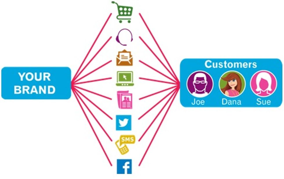
1. Create Cross-Channel Brand Consistency
Landing pages designed with the same messaging as other marketing channels may prove to be more effective in 2014.
According to Accenture and their research on the behaviors of 6,000 consumers in eight countries, it's important to provide a seamless retail experience in order to see the best success. Consumers want a consistent, personalized, and on-brand experience regardless of the channel, so when designing your landing page it's important to be mindful of your brand and messaging.
Think about creating consistency in colors, tag lines, fonts, features, and copy across social media, landing pages, email marketing lists, and other communications.
Let's take a look at a brand that I saw grow in local space, which is extraordinary for a company which started just 3 years ago from a single city operation.
I present to you 14th Street Pizza, Pioneer in New York style 20-inch. hand-tossed pizza!
This study will give you a picture about how brand consistency is achieved through visual design and how you can leverage that to strengthen relationships with your customers, who might have different preferences when it comes to social media usage but still want to be connected to the main personality of your brand.
Website
Your website is your store front or playing field, where you can hit home run if you understand your customer well. When you're starting out it is important to develop a branding theme, which you should keep consistent on your website, social media, packaging and even offline marketing.
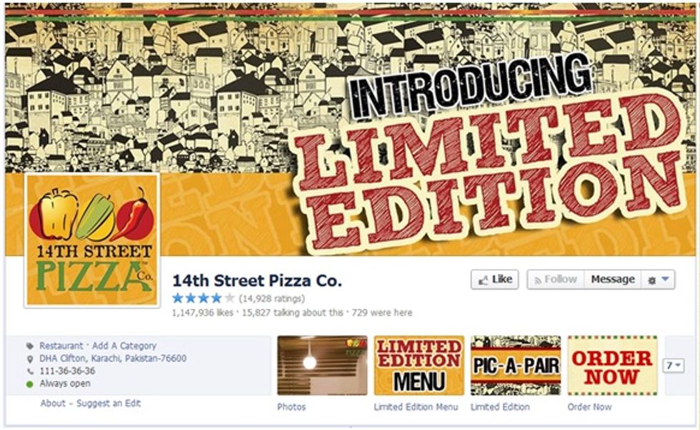
Below is a screenshot of 14th Street Pizza. You'll see further down the post how it aligns with the design consistency on social media channels they're active on.
14th Street Pizza has been known to come up with unique and different campaigns over the course of two years. The brand is going very well and is known for its active social presence and has amassed more than 1.1 million fans.
We can see that they're using the same graphic elements through their feed with high engagement.
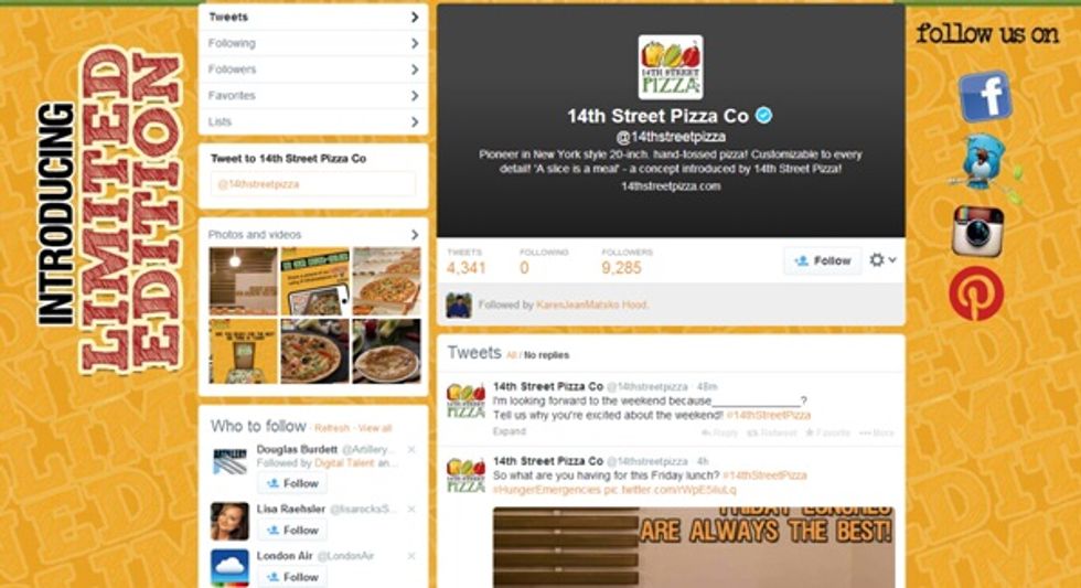
Twitter is the second most popular social media channel. The consistency can be see here as well, and it provides an excellent experience.
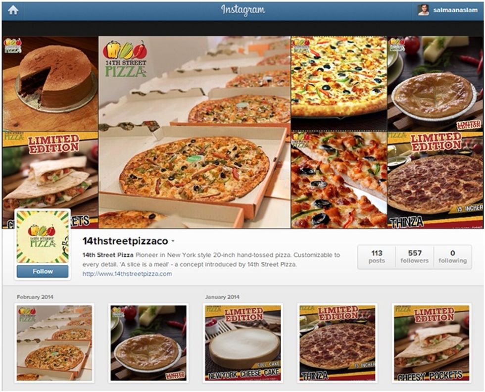
Brand consistency does not mean a common profile picture or a common message but it's simply something that tells people they are communicating with the same brand across different social channels.
Check out how they go about launching campaigns across different social channels. The key takeaway is that you don't necessarily have to invest heavily into product photography or graphic design; however, it is necessary to have a common font, color scheme, and minimal design that you can carry across different channels.
2. Convert to Responsive Design
Mashable named 2013 “The Year of Responsive Design” and Google recommends responsive design -- we see why it is important as more users than ever are using tablets and mobile phones to browse the Internet, so it's critical that your landing pages can adapt to this trend.
Why should you care about responsive design? Simply because it increases conversions. Nielsen reports that 29% of smartphone owners have used their device for online shopping and the number will increase as more retailers convert their website to a responsive design, which will offer better user experience.
Top performing landing pages are going to need to be responsive to what device a user is coming from to ensure the best possible user experience as well as a better conversion rate.
When designing your landing pages, remember to keep things simple: multiple fields or cumbersome questions to fill out to get to the next step will only cause higher bounces, especially for mobile and tablet users. Instead, look to develop landing pages that are fast and well designed for viewing on all screen sizes and devices, and have a quick and painless conversion process. The fewer steps you have, the better.
Two main reasons why you should consider a responsive design are:
- Better User Experience
- Increase in Conversions
User Experience
As I discussed earlier, it is extremely important for brands to have a consistent theme, design, and message across different channels but it also applies to having consistency for different devices. That is where responsive designs come into play as they provide a better experience across different device sizes.
And while responsive design provides a better user experience, it is also has benefits for business owners as they only have one website to build, manage, and optimize. They can leverage the SEO Efforts for mobile users (as mobile searches are growing) and also allows hassle-free content sharing as there is only one URL, compared to mobile sites where content that is shared leads users to weird looking pages on a desktop.
Increase in Conversions
A lot has been written about responsive web design, and one can go into the technical side of it; however, at the end of the day, what matters are the conversions a website is generating and from what we've seen, responsive web design and landing pages deliver higher conversions.
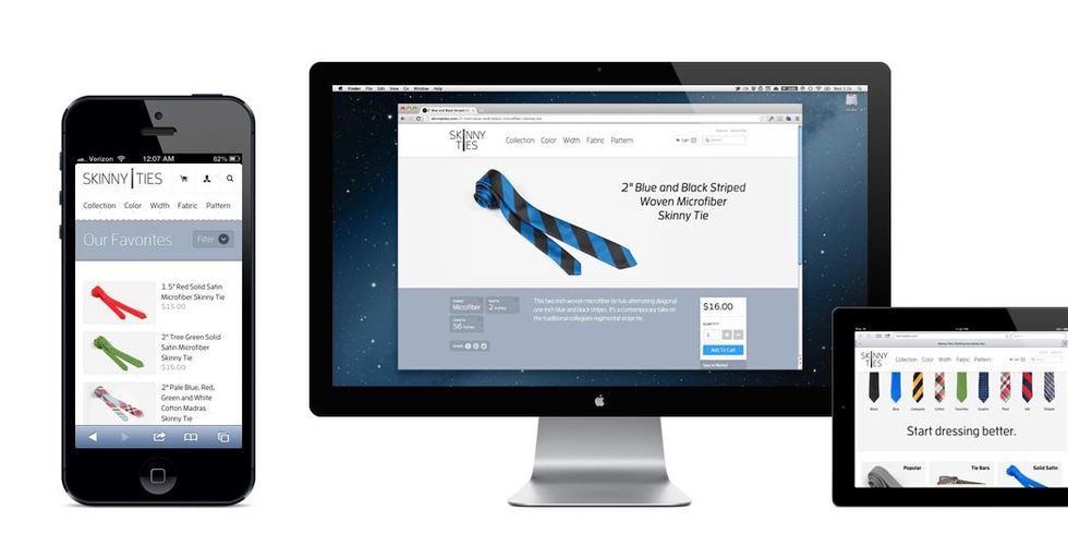
One my most favorite case study has been of Skinny Ties, a family-run company that has been designing and producing neckties since 1971.
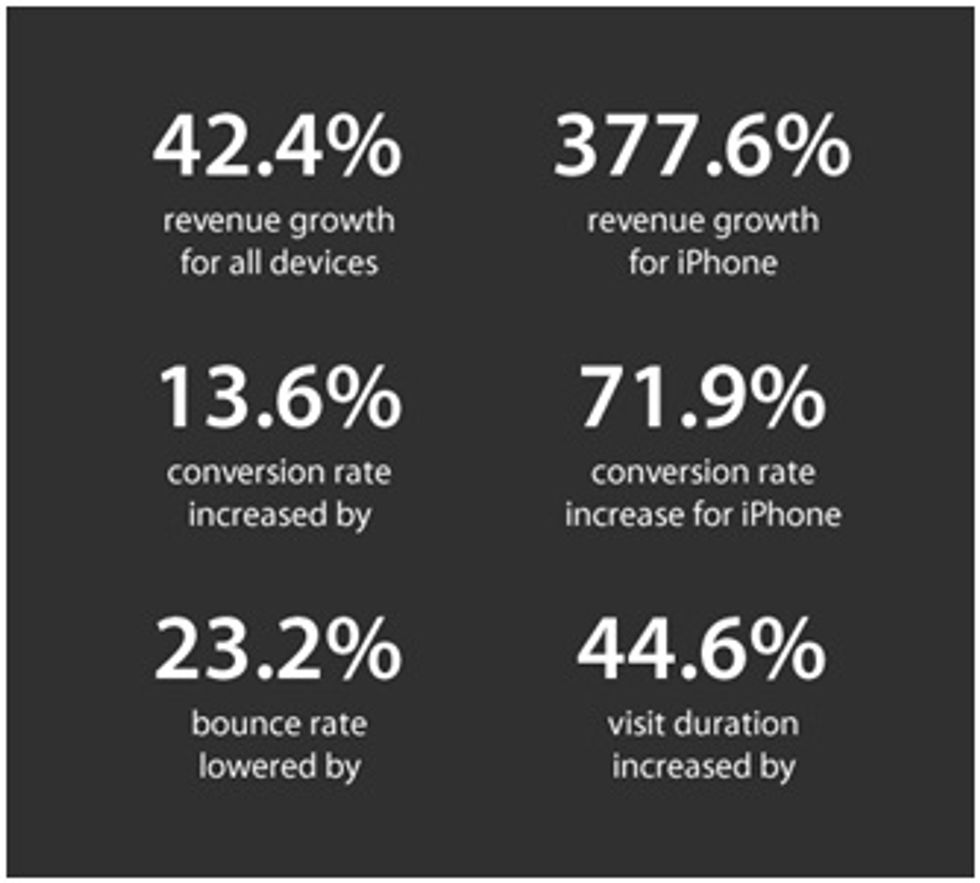
They redesigned their website in Oct. 2012 to prepare for the surge of traffic from tablet and smartphone users and the results were massive. Check out the screenshot below with numbers compared to previous three months' statistics.
Check out this Case Study on Responsive eCommerce.
3. Embrace Personalization
Nearly three-fourths (74%) of online consumers get frustrated with websites when content (e.g., offers, ads, promotions) appears that has nothing to do with their interests. (Source: Janrain & Harris Interactive)
Big boys like Amazon, Netflix, and Pinterest aren't the only players in the personalization game anymore.
As we move through 2014, we expect to see more and more sites focus on developing a personalized user experience so that those who browse or land on a particular landing page get messaging that's consistent with their likes, preferences, and even their geographic location. This makes for a seamless and much more targeted user experience, which may mean more work in design and implementation -- but also more success in your overall conversion rates.
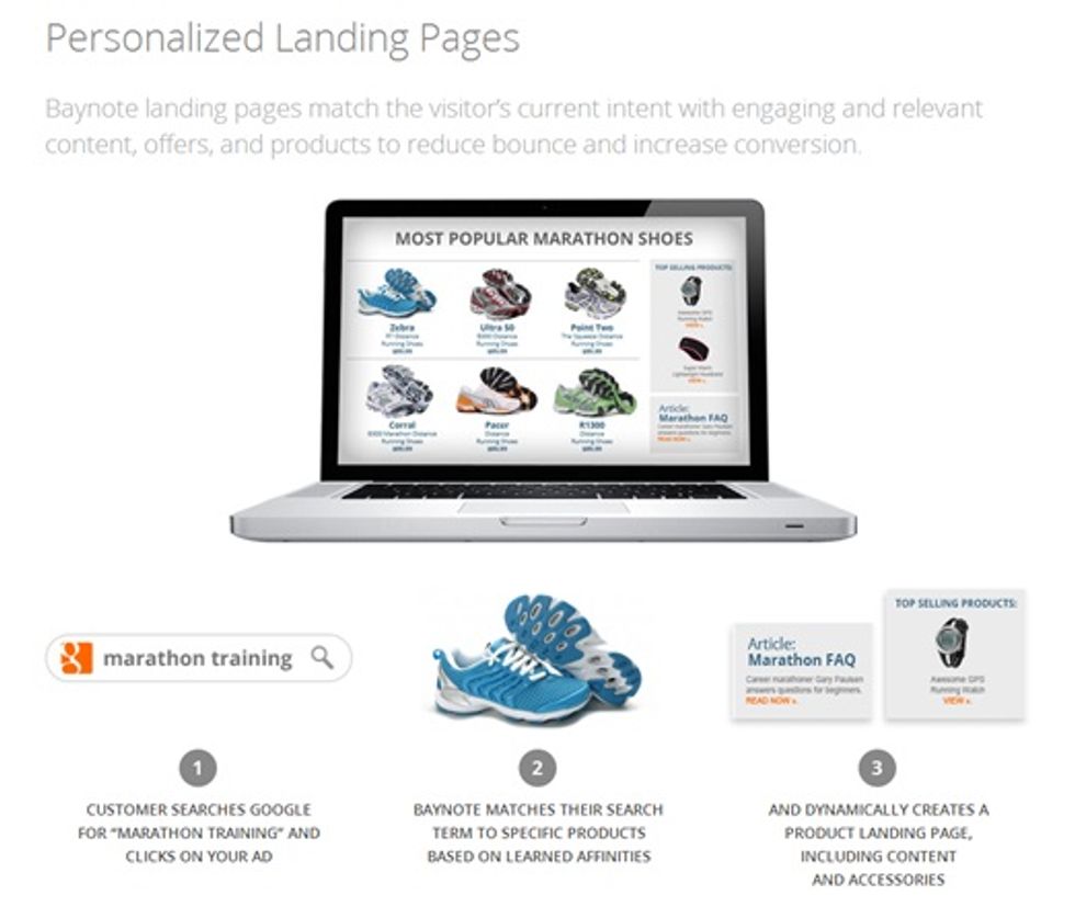
Here is a sneak preview of how personalized landing pages can yield great results.
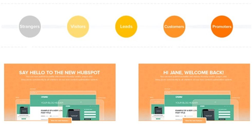
Now this looks pretty for sure, but what if you are not into eCommerce and want to include personalization on your landing pages? Enter Hubspot COS which allows businesses to collect leads and display personalized messages to users at their particular position in the inbound marketing cycle.
Hubspot revealed that calls-to-action targeted to the user performed 42% better than calls-to-action that were generic, so why miss out on this exciting opportunity? But make sure you've got your action plan figure out or you'll be adding a lot of cost in your business obsessing over "shiny objects" syndrome.
4. Understand User Psychology
We're all about to become scientists and psychologists. As landing page design becomes more intricate and competitive, website owners need to start looking more at the psychology behind web users to design more effective landing pages.
From the colors you choose for your calls-to-action to the copy you write to persuade, it's going to be all about using buyer psychology to create the best possible experience. Before, most industries tended to work off of rough data sets and preconceived notions of who their visitors were. Now, we've got to think harder and get more specific by using research studies and analytics to back up our decisions. Now is the time to start bookmarking data powerhouses like Pew Research Center, Accenture, HubSpot, eMarketer, and other data collectors. We need to get inside the heads of our visitors -- literally.
Also, tying into this, we expect to see more "human" elements work their way into landing pages. Things like photos of real people rather than stock photos, social proof via testimonials, and appeals to one's sense of emotion as well as senses will all be a big part of what's to come. After all, who wouldn't relate to being human? A great demonstration of social proof can be seen in a real-world experiment called the “Man looking skyward.”
In 1969, a study by S. Milgram, L. Bickman and L. Berkowitz, was performed on the streets of New York City in which a man was standing looking up in the air. The goal of the experiment was to see if social proof played a part in the reactions of passersby.
One Man Looking Up
For the single man standing in the street, the study showed most people would walk past him and not pay any attention to what he was looking at.
A crowd of people looking up
When the group of staring people increased to five, people started reacting by joining in and looking up to see what was going on. Finally, increasing the participants to 18 people resulted in a 400 per cent lift of people stopping to join the crowd.
It’s a natural tendency for humans to copy one another, even without realizing it -- we like to be a part of tribes and social communities. So when we notice our social circle is doing one thing, we tend to follow suit.
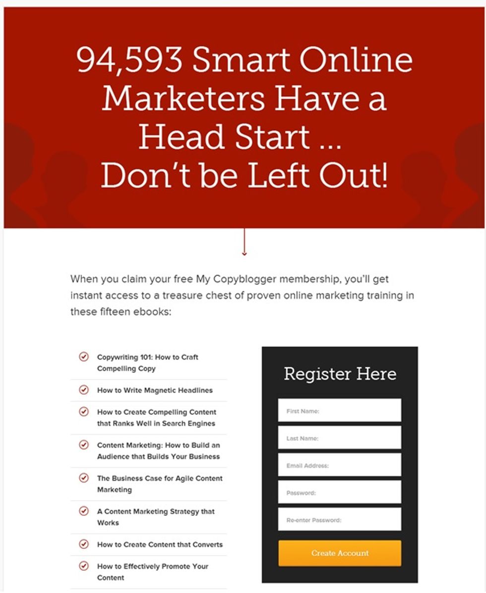
A great way to indicate how awesome an offer is to mention the number of people who have purchased, downloaded, or signed up for your product/service that can add a lot of credibility to your landing page and help increase conversions.
5. Leverage Data from Analytics
Analytics will continue to become more advanced and more important in landing page design. We'll see more and more A/B and multivariate testing, as well as new tools pop up that can help site owners develop smarter pages based on devices, demographics, user preferences, interest, location, and a host of other factors. This is an area we're excited to see grow and develop – but it's also an area that we can't as clearly predict.
We do think, however, that we're going to see more real-time data and more user-intent related metrics, such as what users tend to be interested in or what topics they tend to engage with most. We already see this being rolled out with the new Facebook Page Insights, Pinterest Web Analytics, and Twitter Analytics, but we hope to see these expand across other tools and channels.
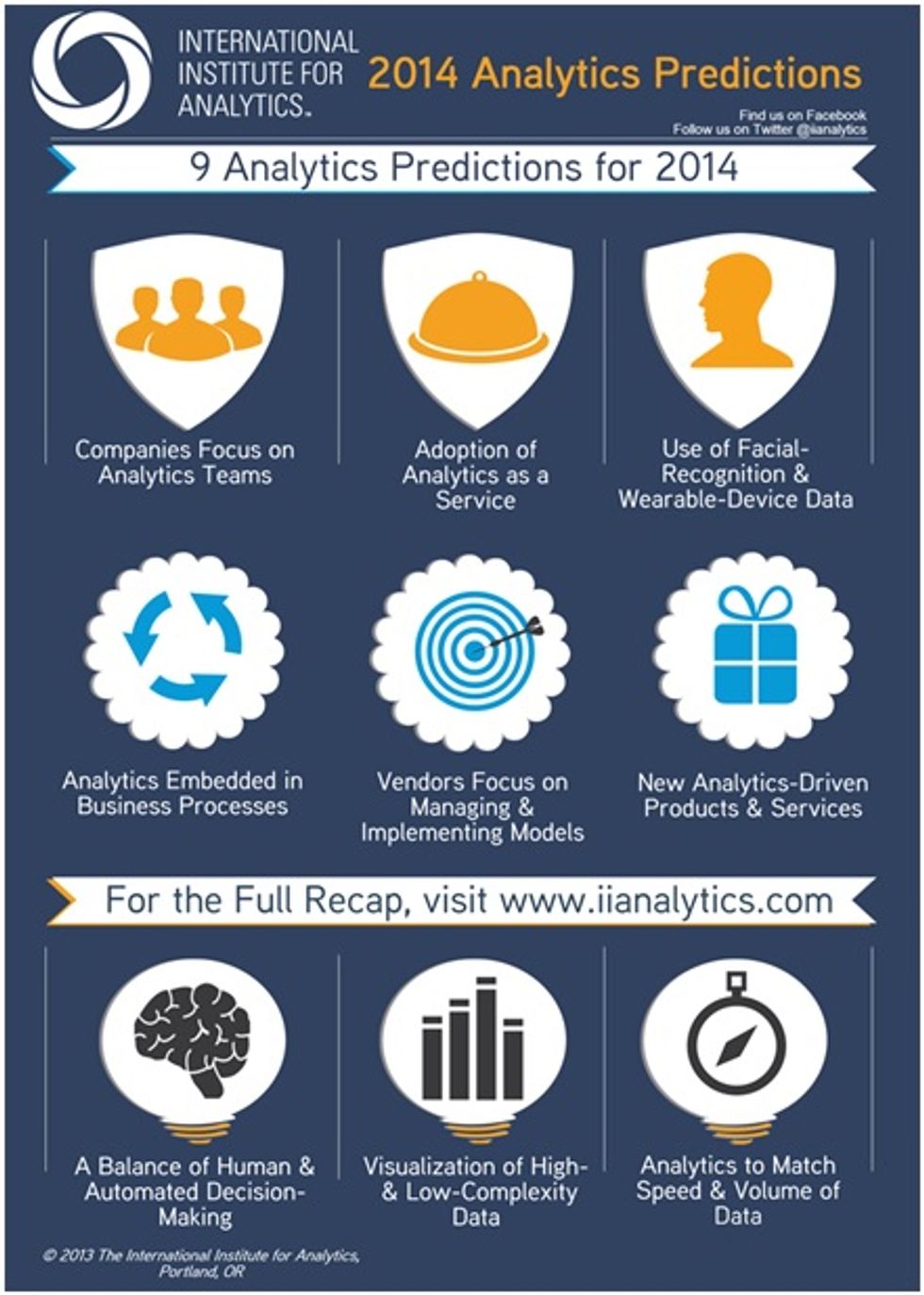
International Institute of Analytics have made few predictions that would definitely help a lot of data geeks explore the opportunities that lies ahead when it comes to data analysis and implementing that to improve business processes.
6. Practice Evolutionary Design
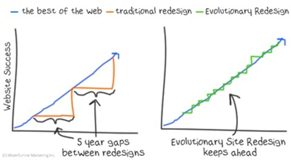
Thought you only had to update your site's overall design every 18 to 24 months? Think again. Many site owners are now practicing evolutionary design, using data over periods of 90 days to determine incremental changes that can be made to their site to improve both conversion and user experience.
This turns traditional web design on its head, as in the past it used to be all about long gaps before refreshing.
Instead, it's about making small but impactful changes that users can grow with and become used to gradually. This builds trust, recognition, and improves your site's ability to retain visitors and keep them coming back for more.
The Big Performance gap with Revolutionary Site Redesign
However, exercise caution: only make changes that make sense or that you have data to support and don't make the changes too often; otherwise, you risk alienating users instead of engaging them.
If you're looking for some inspiration, make sure you check out how MediaTemple.net redesigned their website based on ideas they received from customers, and also check out Bluehost and Namecheap as they've gone through a redesign recently.
