As an online marketing firm, we recommend that our clients consider redesigning their website every two years. This doesn't mean that they should redesign every two years, just that they should begin thinking about it at that time and polling honest friends to see if "it's time". It is very, very easy to "let your website" go, and then before you know it your design is the equivalent of the mullet: dated, out-of-style, and a poor reflection on you and your business.
We recently overhauled the website of a client of ours, highriskpay.com, and I'd like to use that redesign to illustrate some key tips as you begin your re-design journey.
1. Use Trust Signals
This client is in an industry where trust is everything: financial services. This company provides merchant accounts, and so their customers are entrusting them with credit card numbers - trust is paramount. As such, we put the trust signals front and center. At the top of the site is the BBB A+ rating logo, right under their header image are four logos of associations they are a member of., and right under their services is a testimonial. The page is over-the-top in establishing trust in the mind of a customer.
The BBB logo adds instant credibility, and thus we display it both in the header and also near the submit button on the form on the home page.
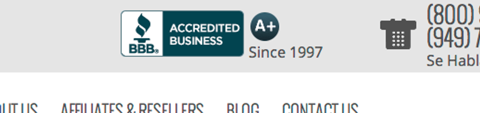
The membership logos, while not the best, are better than displaying none at all.

When you are designing your website, think about how your customers come to trust you. Don't make clients wonder if you are trustworthy or not; rather give them enough signals so that the idea of trust never even has to cross their mind.
2. Have a Clear Call to Action
Website visitors should never wonder, "what should I do next?". Instead, the entire process should be incredibly guided, and it should be clear what you want them to do. In the case of our client, we want a form filled out, so that is what is most prominent on every page. Our header has an arrow that points over to the form. The biggest button the page is to submit the form. The top of the form creates urgency with "Sign Up Now!"
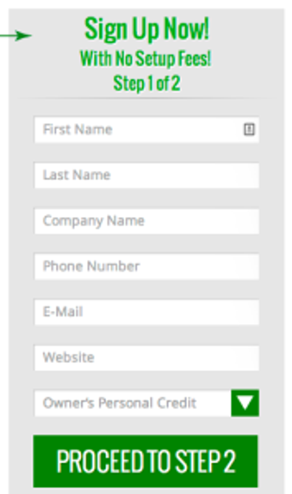
Prioritize what is most important for you on the site, and then ensure that it is clear to the user that it is important. Your goal could be for them to download a white paper, call in, or visit a product page. No matter what it is, make sure that it is prominent and clear.
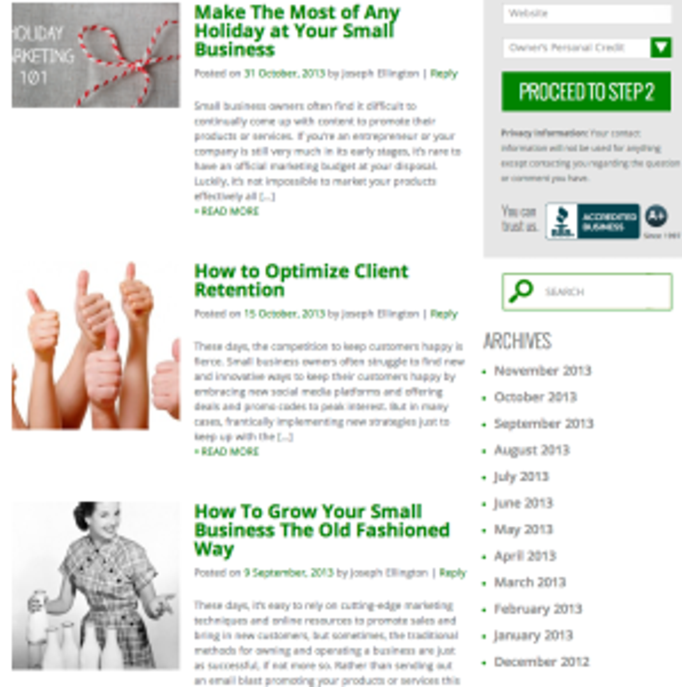
3. Have a Place for Fresh Content
Our bread and butter is SEO, so I'd be remiss if I didn't include something on this list which has a strong impact on the search rankings. The Google Search algorithm is heavily influenced by "fresh" content right now. This means that newer content is often ranking higher than older content, even if that older content is of a significantly higher quality. So it really pays to have a place on the site where you can post "fresh" content to take advantage of this glitch in the matrix.
This easiest place to do this is a blog, and you can see that we added an attractive one on the client's website to give the site fresh content, and also to allow them to post tips and industry news for their customers and potential customers. This has the added benefit of showing that they keep up with trends and this content can be leveraged and shared across their social profiles. Win-win!
The list of lessons learned from designing websites is nearly infinite, as every project is different and brings something new to the table. However, armed with the 3 tips above, some common sense, and a good designer, you are well on your way to avoiding a website that looks like it is stuck in a previous generation.